Creative Director. Designer. Filmmaker.
I am a Mexican creative and storyteller, a husband of a beautiful talented woman, and a dad to two amazing boys. My work moves between design, film, and purpose, creating experiences that inspire people and ideas that endure.I lead creative vision at Vereda and Townfolks, shaping stories and identities that connect communities and spark imagination. Through RR Films, I craft wedding films, branded content, and documentaries that carry honesty, beauty, and depth.Creativity is a way of building meaning, restoring hope, and revealing beauty in places where it is often overlooked.DEMO REEL 2025
This reel brings together the full scope of my work. It includes wedding films that have been featured in People Magazine and Black Brides Magazine, as well as cinematic documentaries, brand storytelling, and NGO projects. I have also directed campaigns for organizations and institutions with a global reach, including Facebook, Banamex, the United Nations, and major government agencies.
Every project is shaped by the same vision: to create work that is beautiful, meaningful, and able to connect with people on a deeper level.
Concepts, Design and Identity
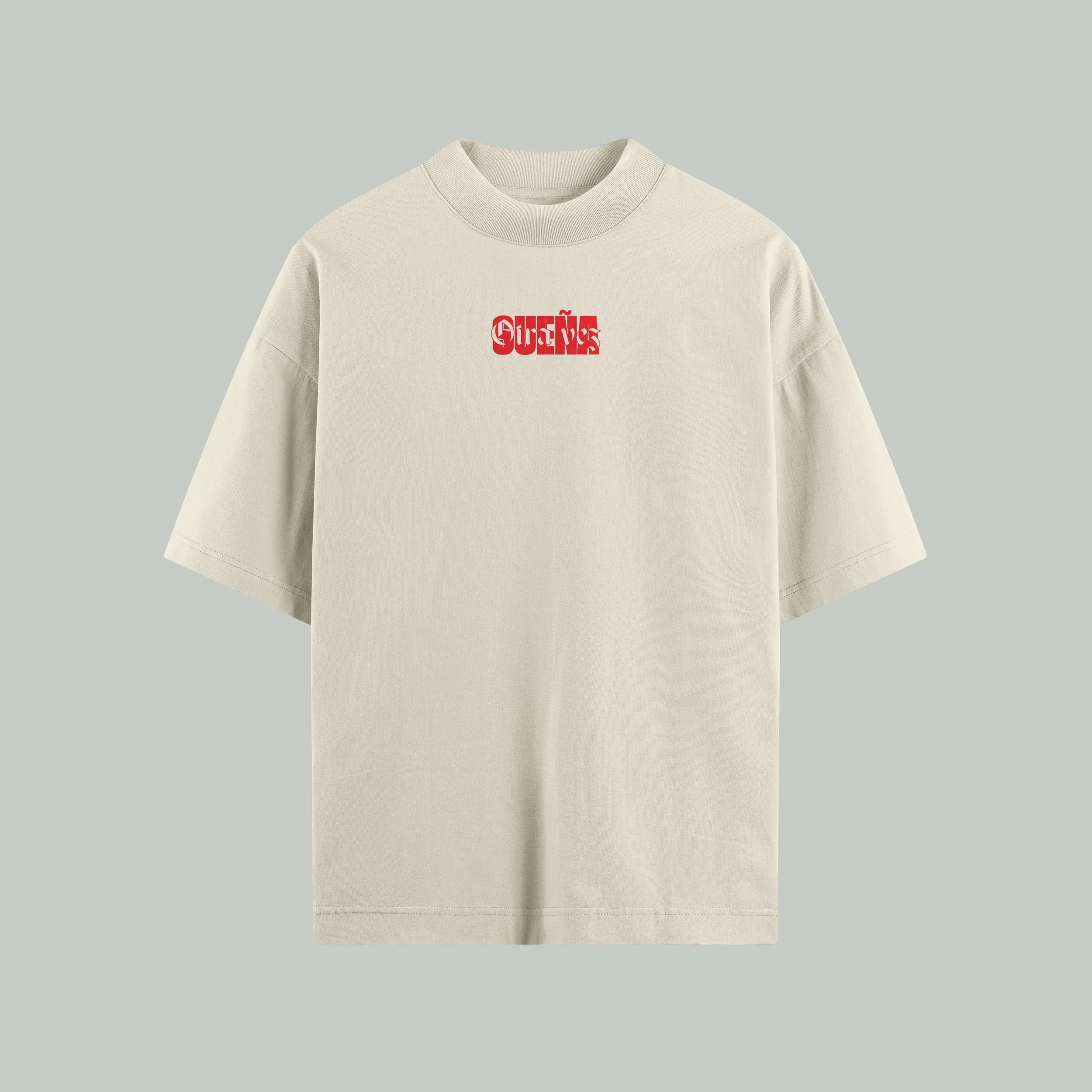
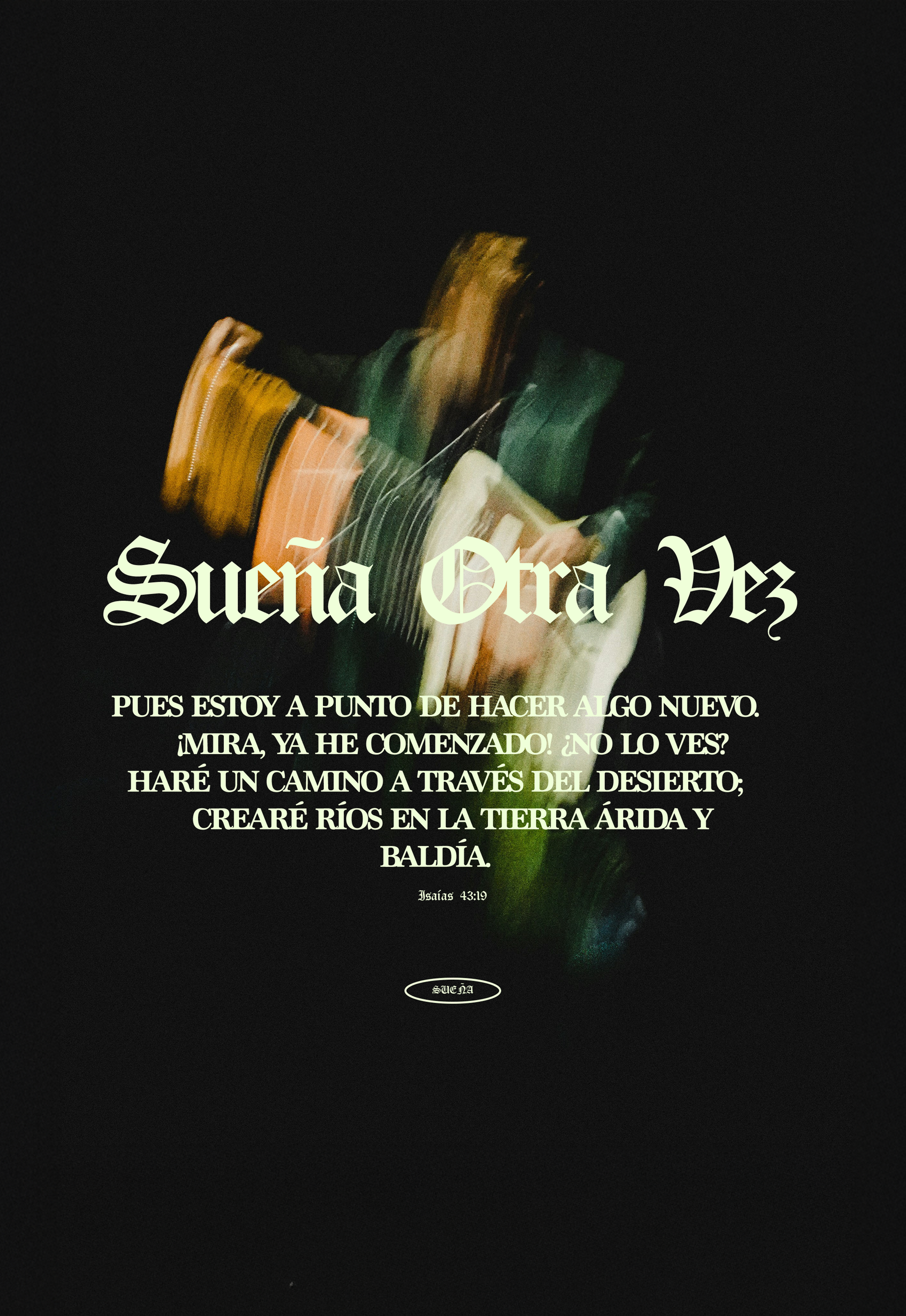
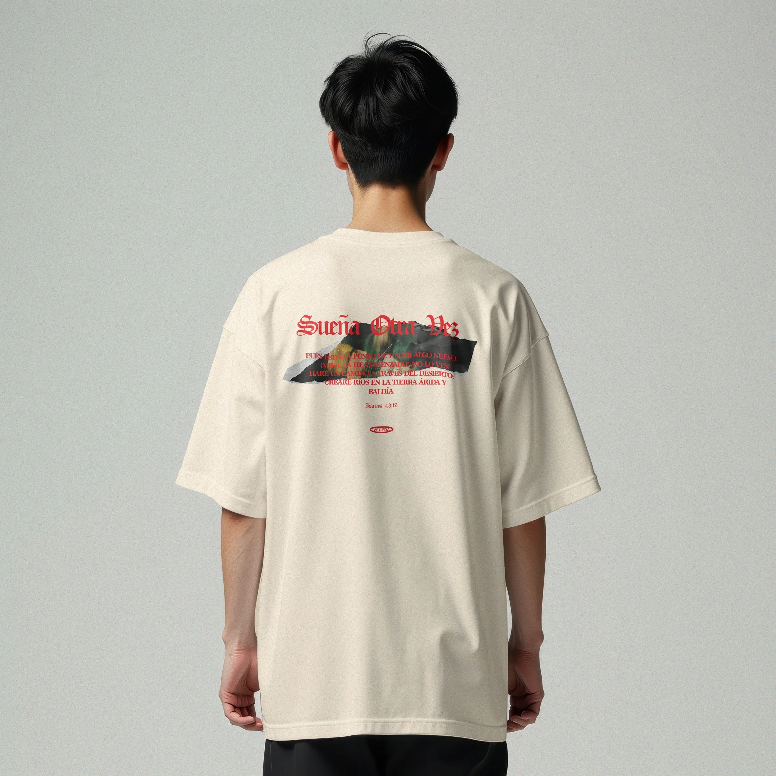

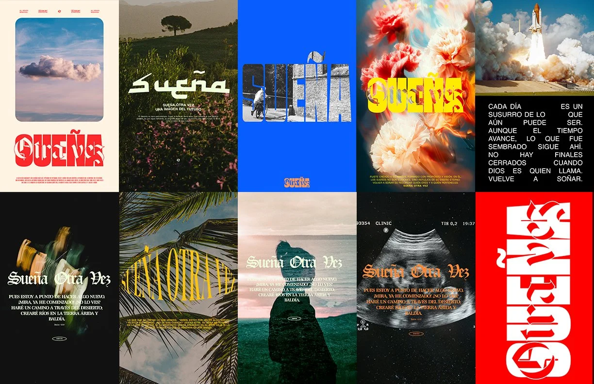
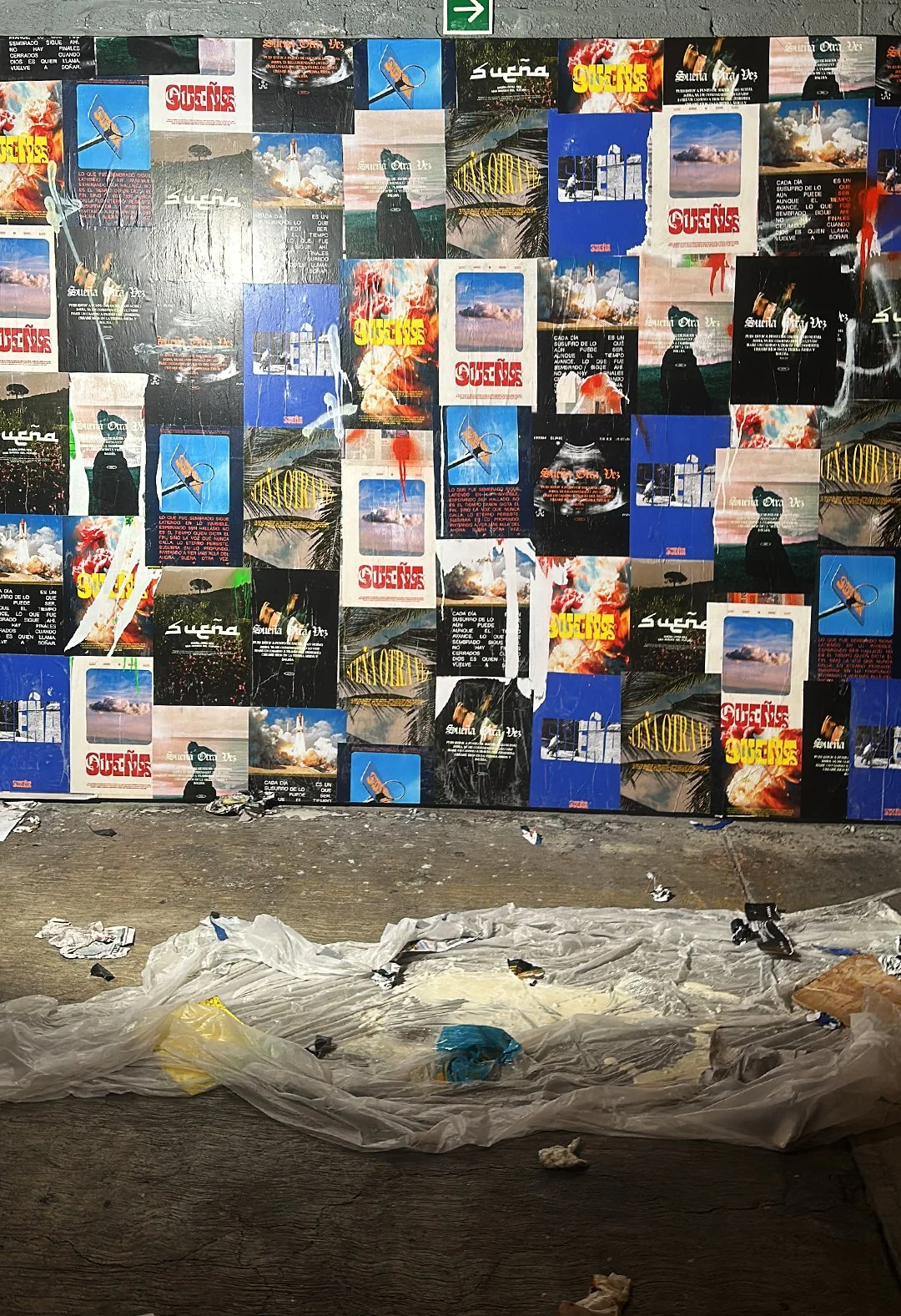
Sueña Otra Vez was the 2025 vision campaign for Vereda, created to spark imagination and invite people to rediscover the power of dreaming again. I shaped the campaign’s creative direction, from its visual identity to the storytelling, merchandise, and multimedia pieces that brought it to life across different platforms.
Each poster was designed with a specific audience in mind, considering age, life stage, and perspective. Together they created a single narrative that blended bold imagery with poetic language. The result was a campaign that moved beyond communication into inspiration and became a cultural statement that redefined how the community envisioned its future.

The Easter design was inspired by the simple but powerful visual language of an on/off switch. I reimagined it as a metaphor for the movement between death and life, creating a design that is both minimal and symbolic.
The concept extended beyond posters into limited-edition merchandise, including apparel that carried the same graphic element. Each piece was designed to stand alone while still working as part of a larger collection, forming a unified narrative that blended design, story, and wearable expression.
MUERTE | VIDA
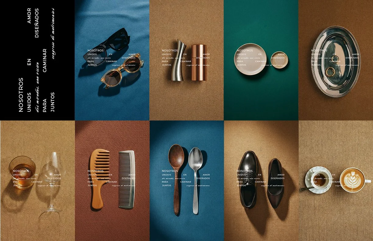
I created a visual campaign built around the idea of “Nosotros,” a reminder that love is designed to walk together. Everyday objects were paired in thoughtful combinations, symbolizing the harmony and contrasts that exist within a relationship.
Each image stands on its own, yet together they create a collective story about unity, difference, and complementarity. The use of minimal backgrounds, editorial lighting, and poetic typography gave the campaign a timeless and contemporary feel while keeping the message clear and human.
Nosotros
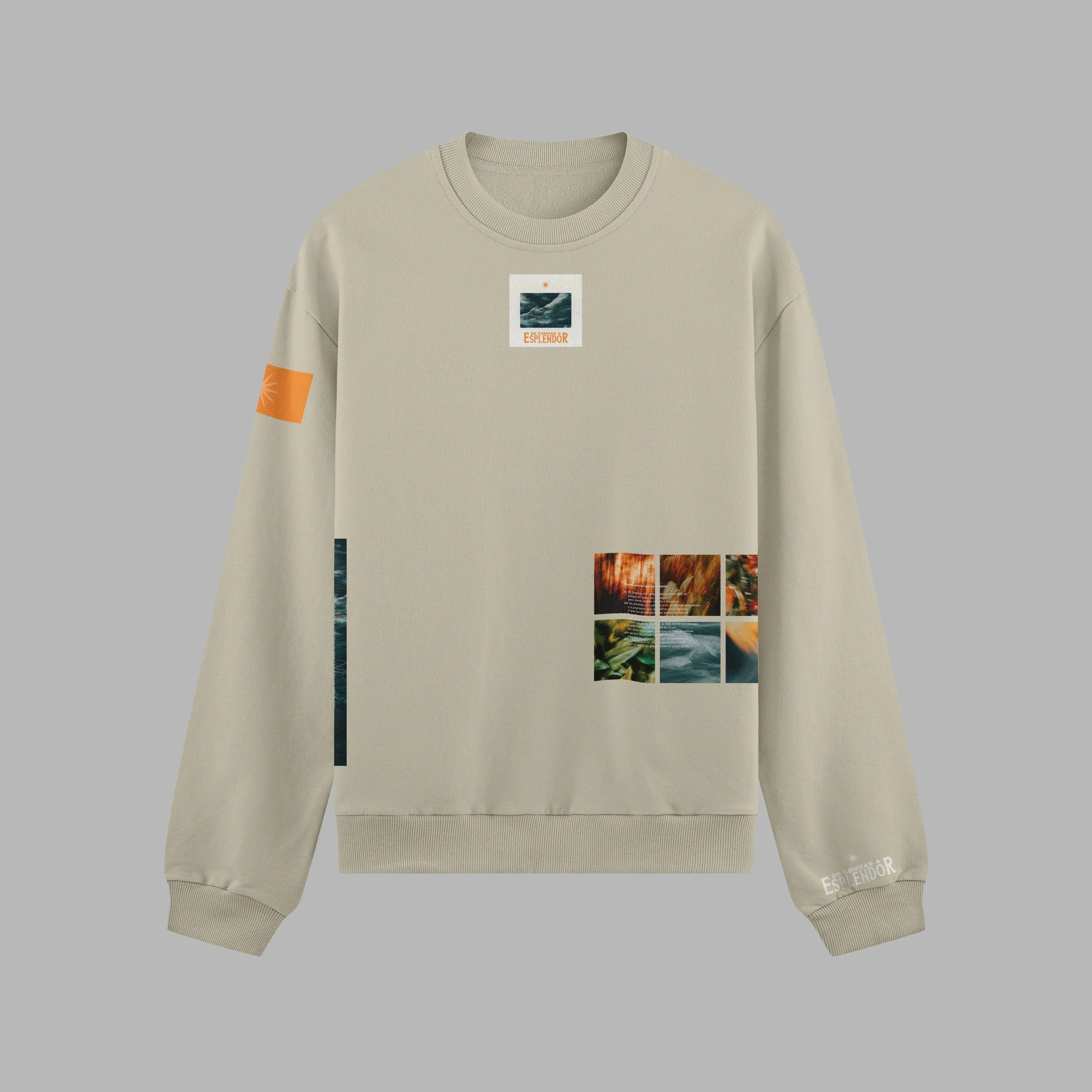
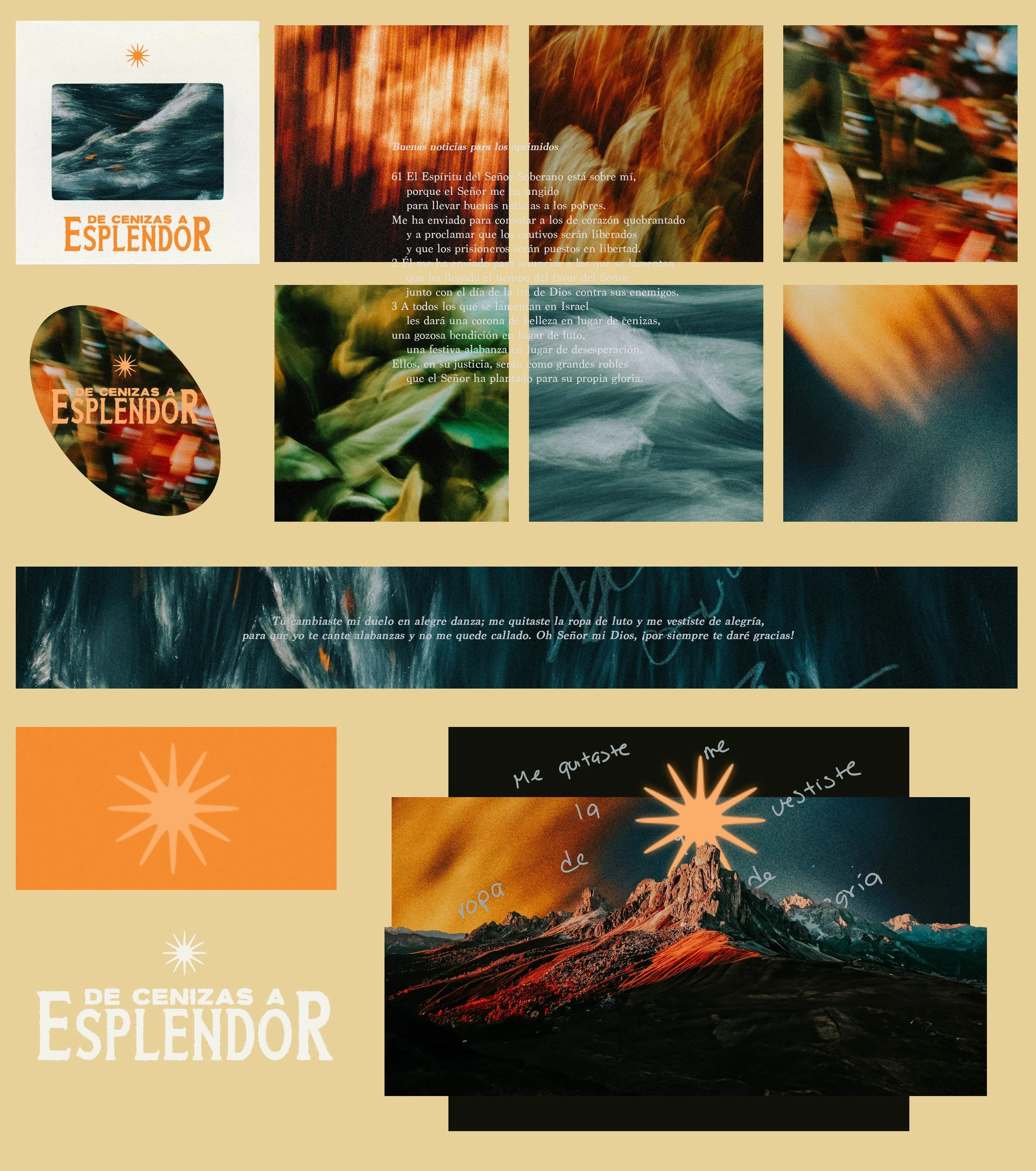
De Cenizas a Esplendor was created as a way to welcome the Christmas season without falling into the same familiar patterns and clichés. The goal was to capture the heart of renewal and hope in a visual language that felt fresh, honest, and deeply human.
The concept came to life through textures, colors, and movement that spoke of transformation. From posters to digital pieces to limited-edition apparel, every element carried the same intention: to turn a message into something people could see, feel, and even wear.
De Cenizas a Esplendor
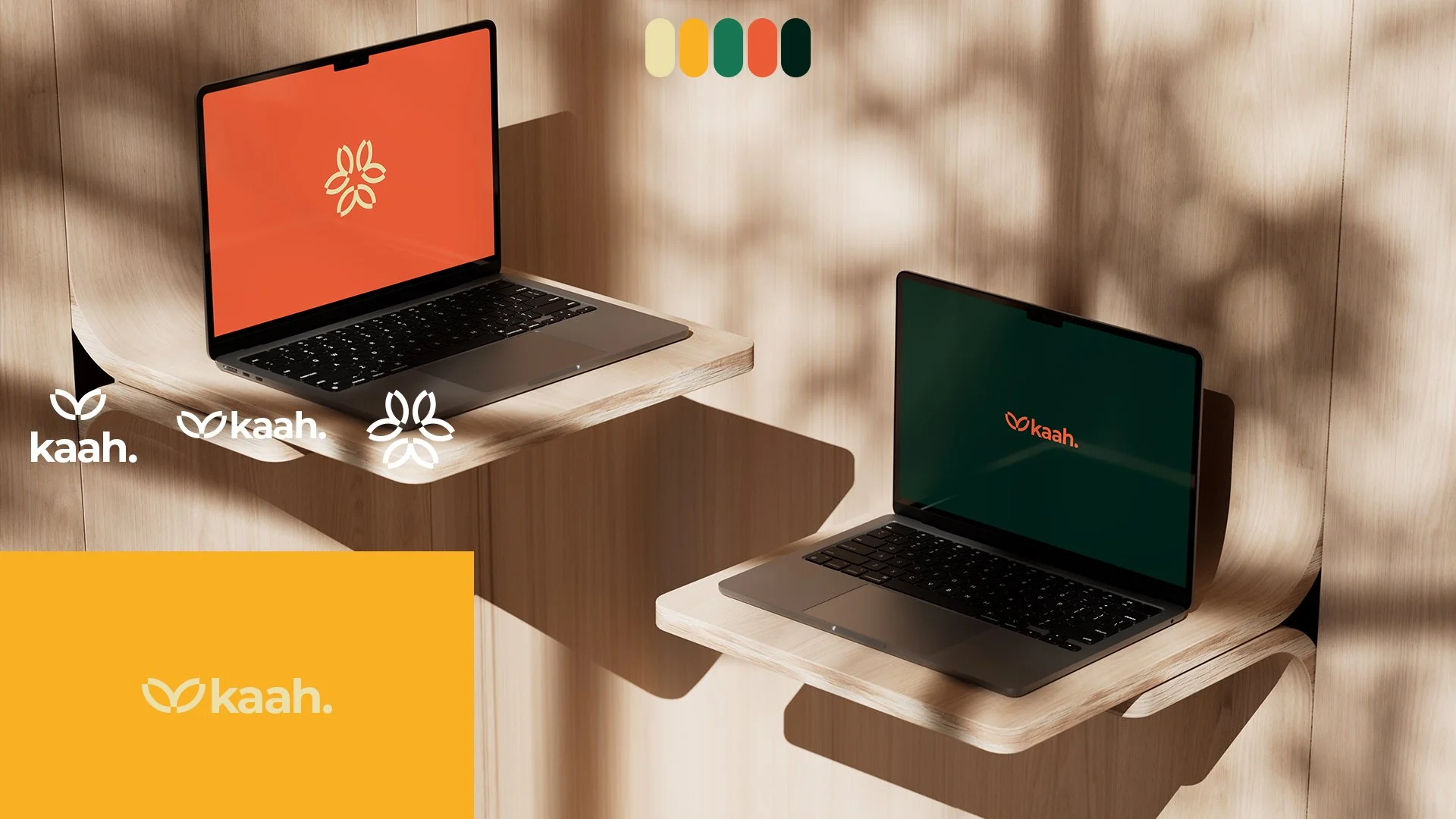
Kaah Sustainable Tourism creates experiences that honor nature, culture, and community. Its mission is to redefine travel through sustainability, highlighting destinations in a way that preserves their essence and empowers the people who live there.
The branding leans on organic textures, natural palettes, and storytelling that connects travelers with both place and purpose. It communicates not only where to go, but why it matters.
Kaah Sustainable Tourism
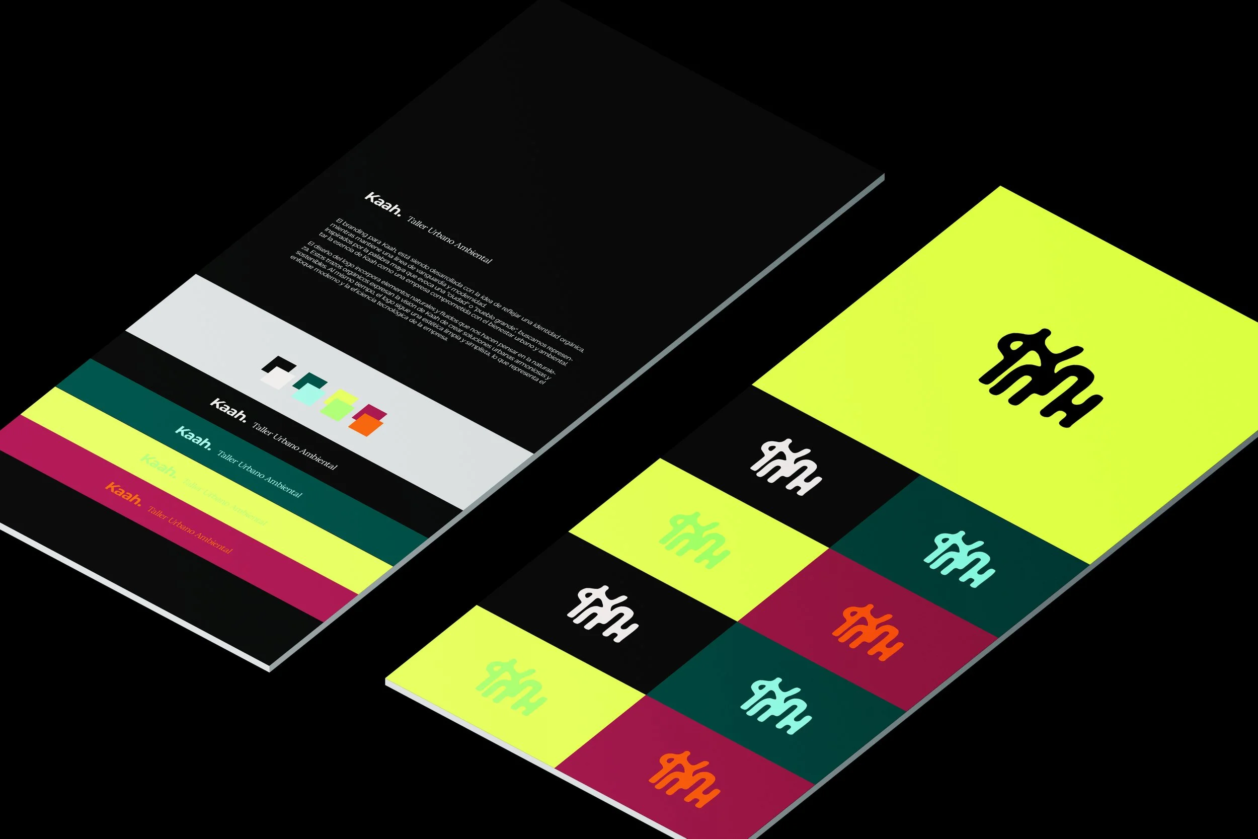

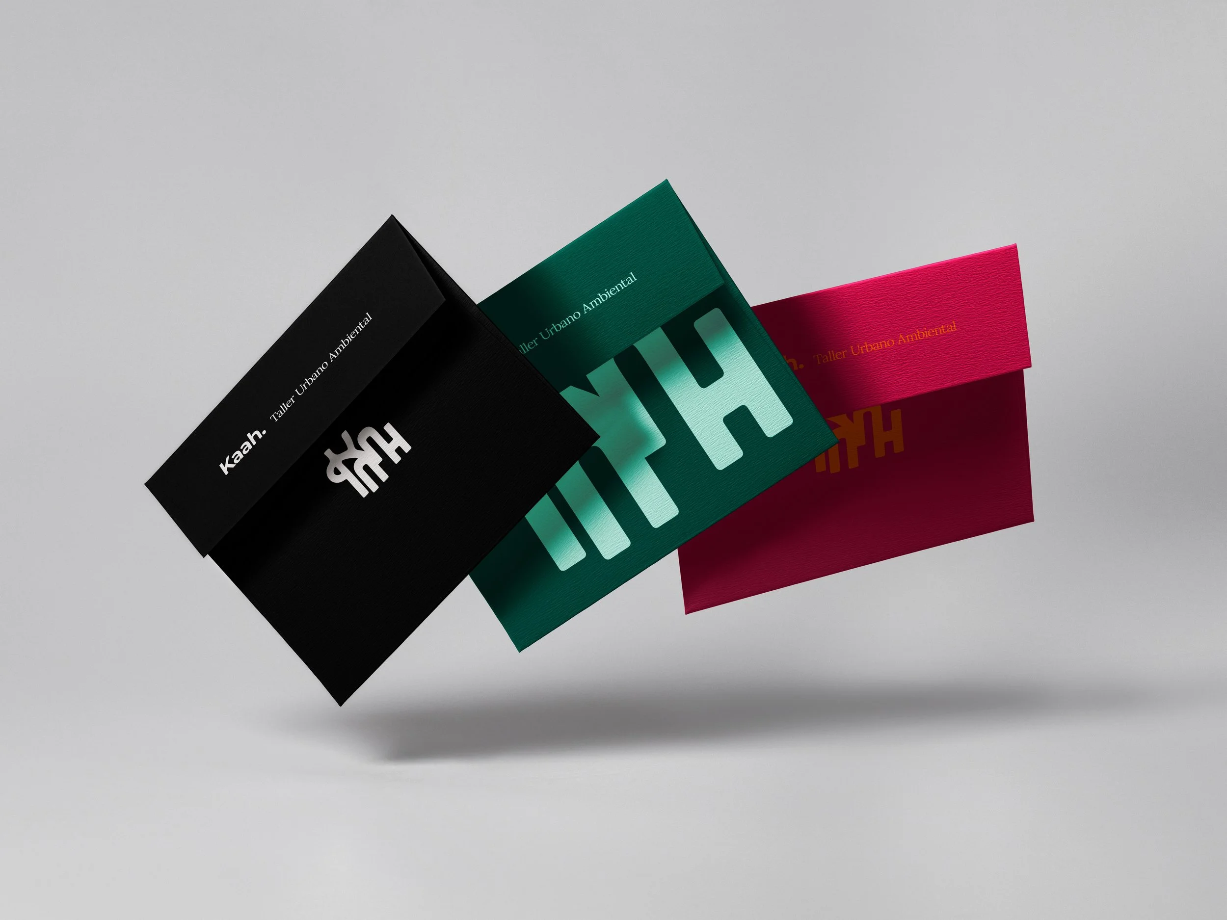
Kaah Urban Workshop is a space for design, planning, and innovation in the city. It brings together architects, designers, and community leaders to imagine urban projects that are sustainable, inclusive, and human-centered.
The branding is more structured and geometric, reflecting the city as a canvas. It balances professionalism with creativity, giving the division a strong presence in both technical and cultural conversations about the future of urban life.
Kaah Urban Workshop
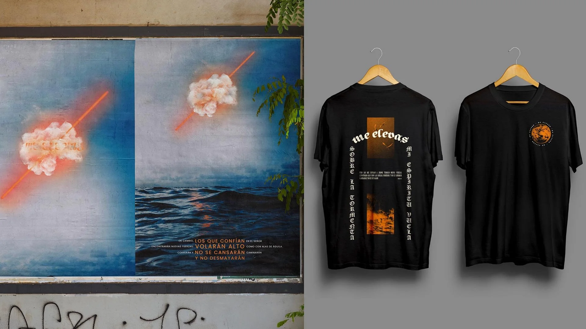
Me Elevas was a campaign created around the release of an EP. The idea was to capture the feeling of rising above the storm and finding strength in hope.
The visuals combined surreal imagery with strong type, mixing clouds split by light, oceans in motion, and glowing gradients. The project extended into the streets through posters and into culture through limited-edition apparel, turning the music into something people could see, feel, and wear.
Me Elevas – Visual Identity for an EP
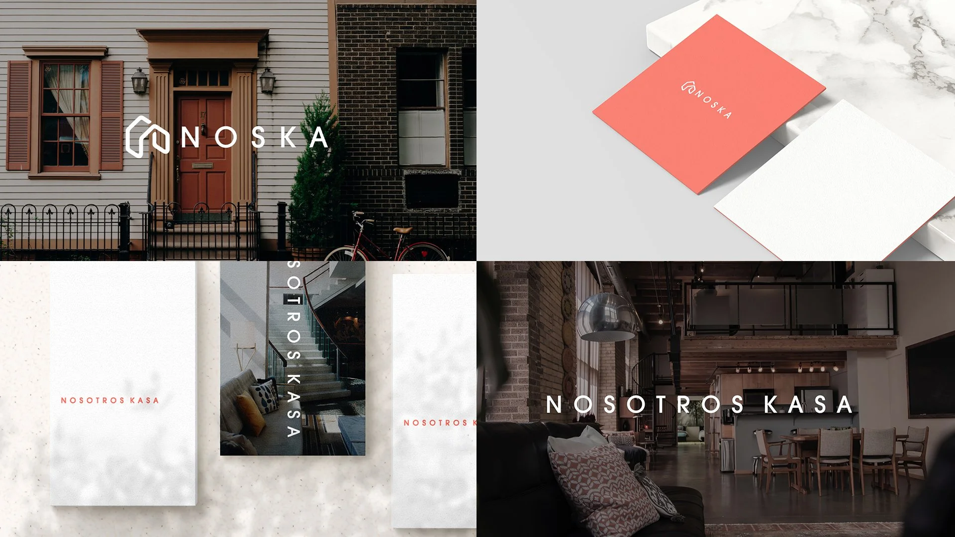
NOSKA
The branding for Noska was created to reflect freedom, flexibility, and the feeling of belonging that digital nomads and modern professionals are looking for. The goal was to balance trust and professionalism with warmth and lifestyle appeal.
The logo is simple and modern, built around the idea of home seen in a new way. The name, which comes from Nosotros Kasa, speaks about community, connection, and the possibility of turning a temporary stay into a lasting home.
The visual identity uses clean typography, soft textures, and fresh colors to create an aesthetic that feels both aspirational and approachable. It works across digital platforms, printed materials, and interior spaces, giving the brand a consistent voice and presence wherever it appears.

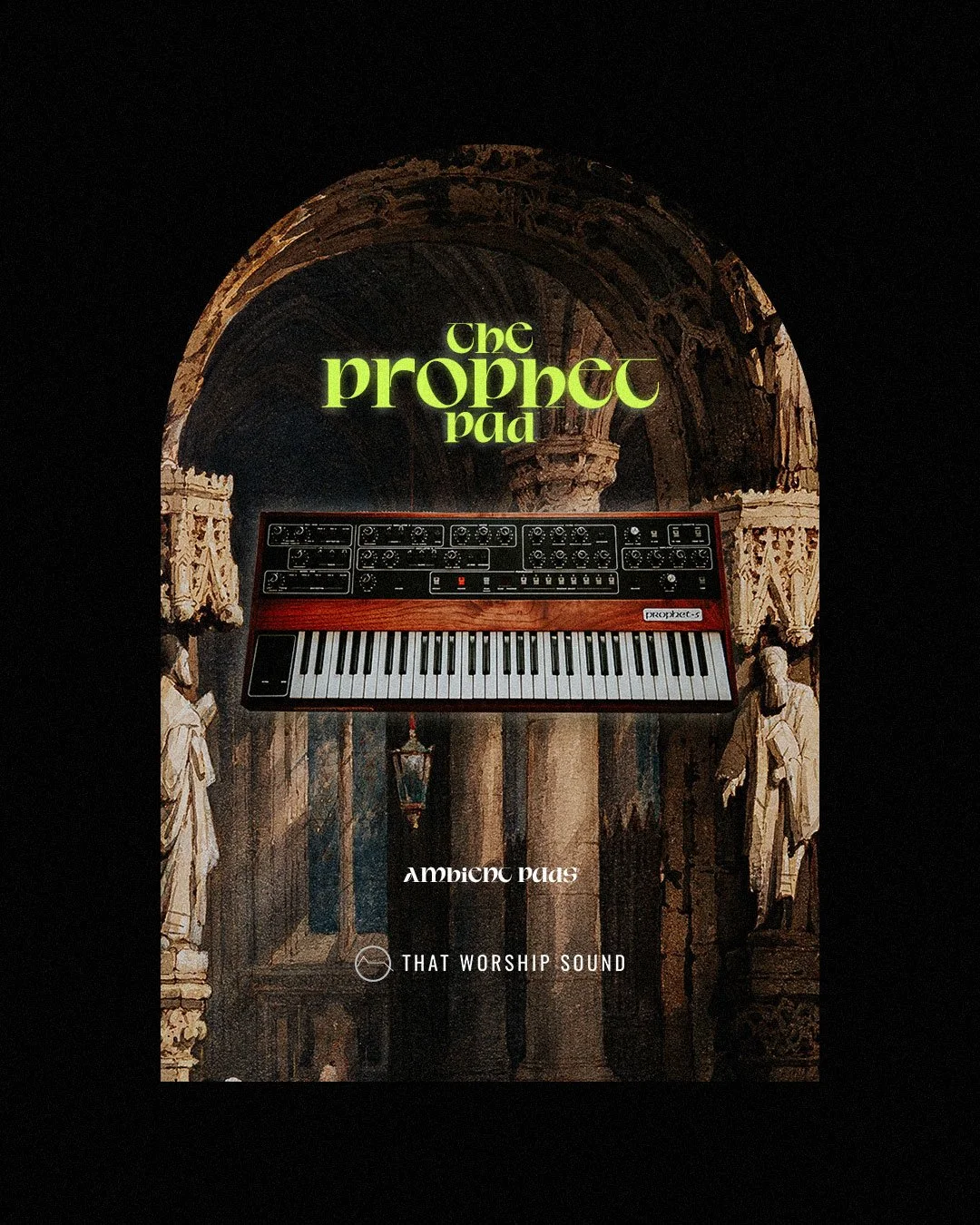
THAT WORSHIP SOUND
This project was created for That Worship Sound, one of the leading platforms for worship musicians worldwide. The company has played a key role in making professional sounds and tools accessible to churches, producers, and artists who want to create music that is both excellent and authentic.
For this release, I designed the visual identity for The Prophet Pad, a sample pack built from the legendary Prophet synthesizer. The artwork combines classical architecture and sacred imagery with the iconic synth at the center, a visual metaphor for how That Worship Sound bridges timeless worship with modern sound design.
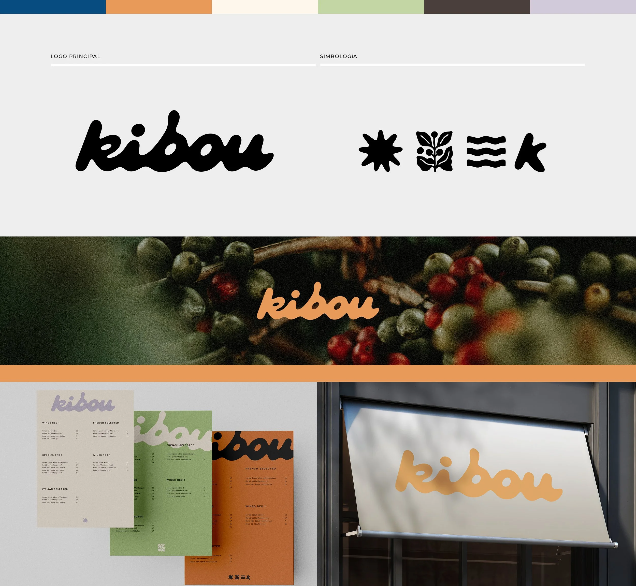
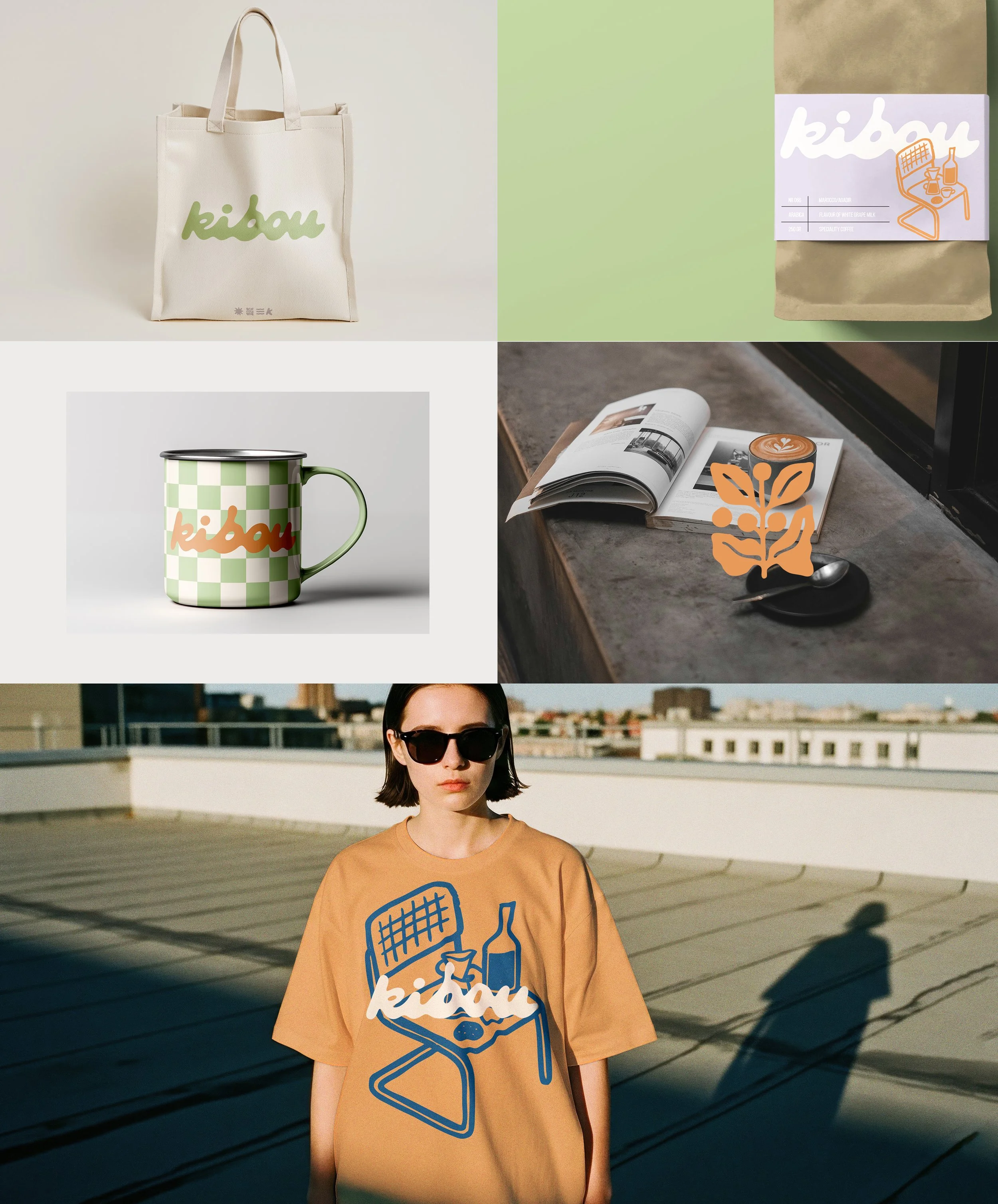
KIBOU
Kibou is a coffee brand created around community, creativity, and the simple rituals that bring people together. The name means “hope” in Japanese, a reminder that coffee can carry more than flavor — it can carry connection.
The identity mixes playful and organic elements with a clean, modern feel. From the custom wordmark to the icons inspired by nature, every detail was designed to feel approachable and full of life. The system works across packaging, merchandise, and spaces, giving Kibou a consistent voice that feels fresh and human.
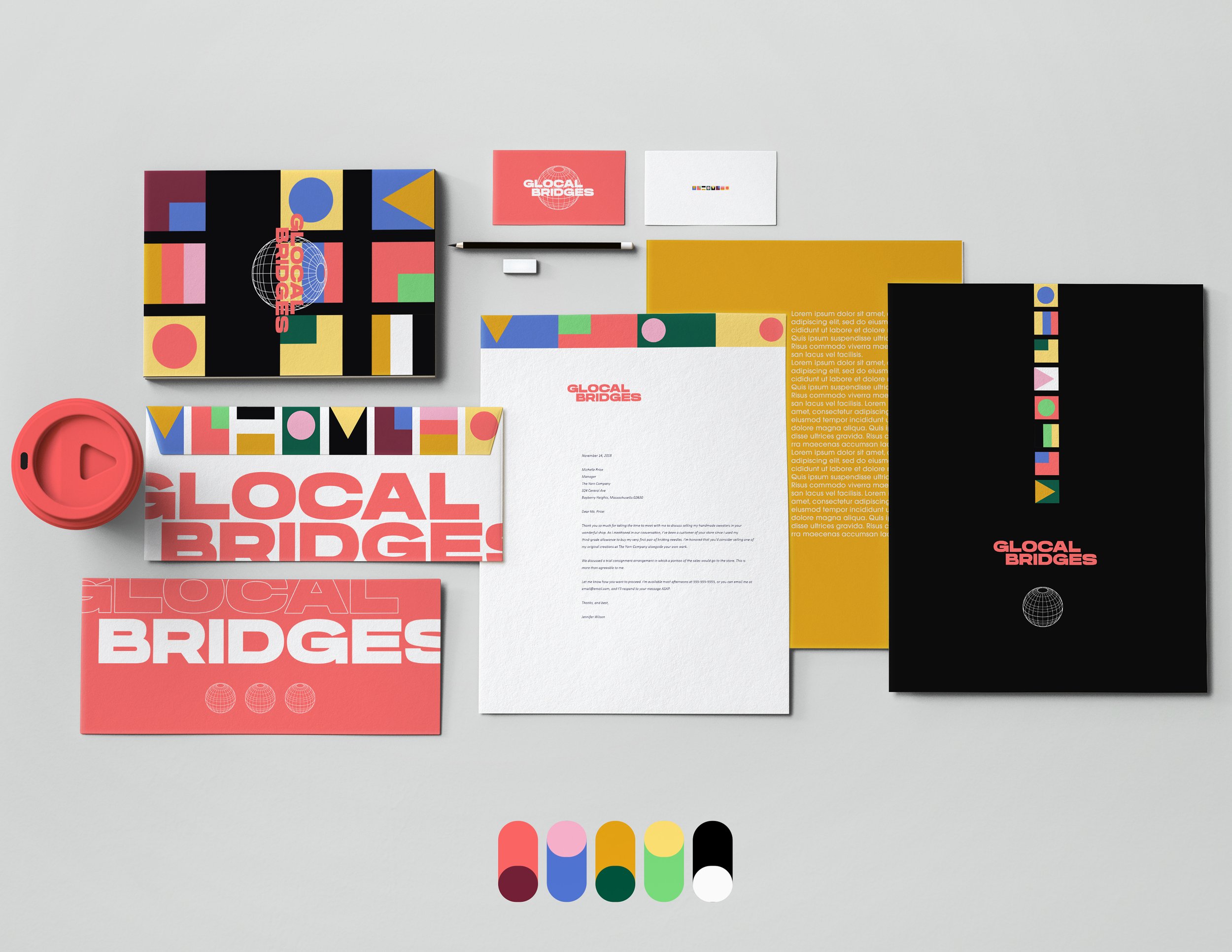

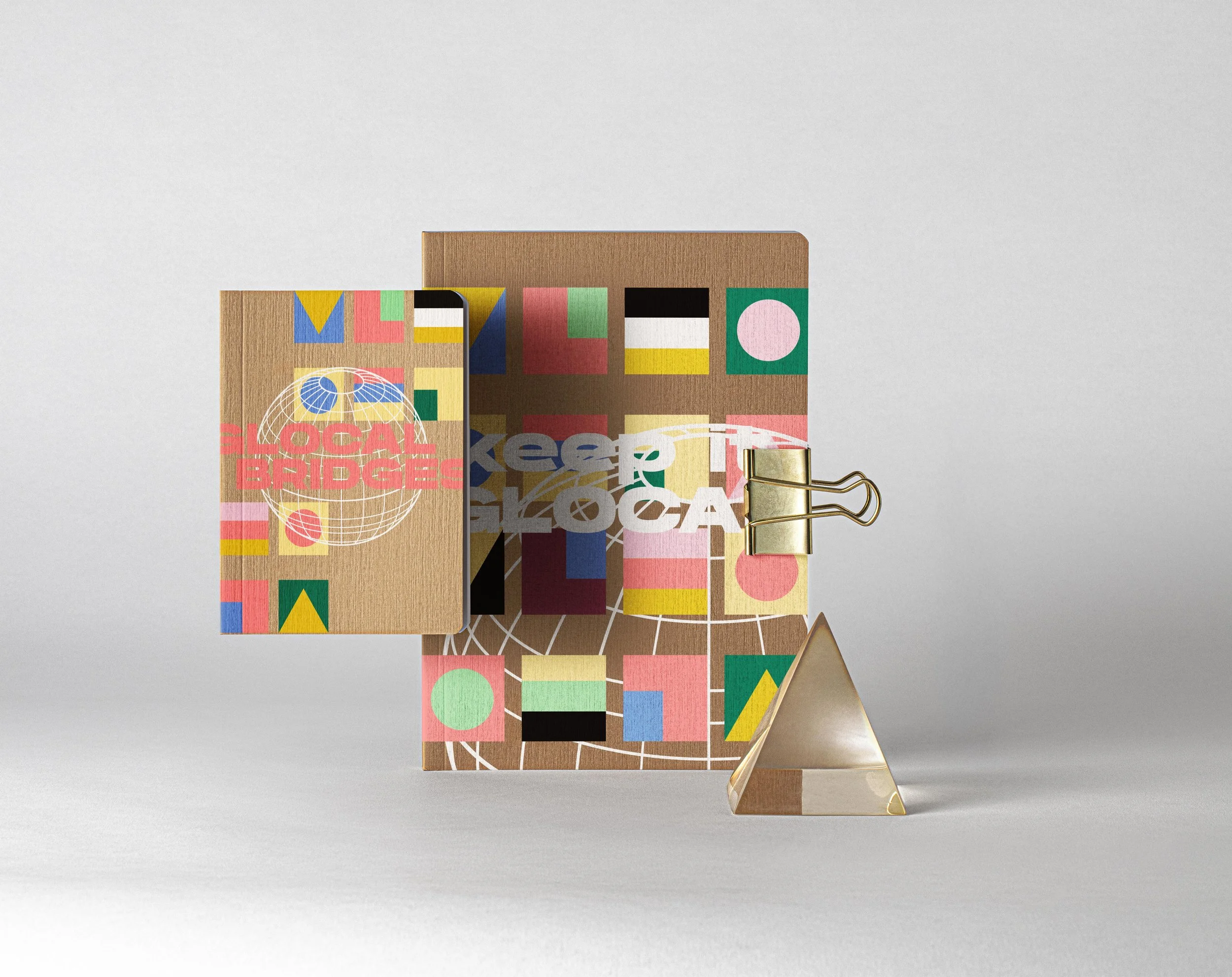
Glocal Bridges is a community initiative created to connect with minority groups across the United States. The goal was to design an identity that feels welcoming, inclusive, and bold enough to represent many cultures coming together.
The branding is built from geometric shapes that suggest flags, creating a visual language of diversity and belonging. These shapes not only serve as a design element but also establish the color palette, giving the system both meaning and coherence.
The result is a flexible and modern identity that works across print, digital, and event materials. From posters to stationery, Glocal Bridges carries a sense of openness, movement, and unity, giving the initiative a strong and recognizable presence.
Glocal Bridges

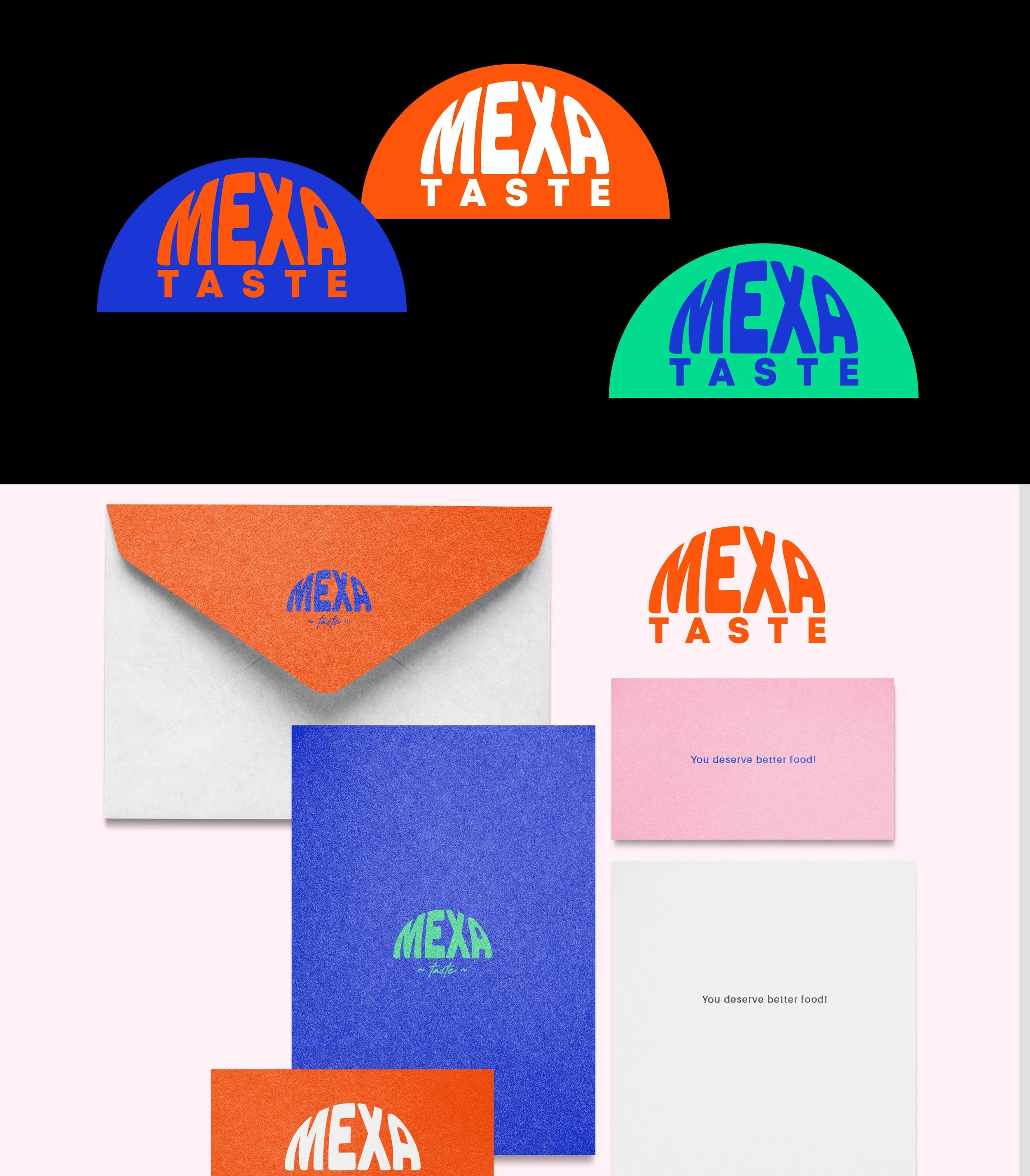
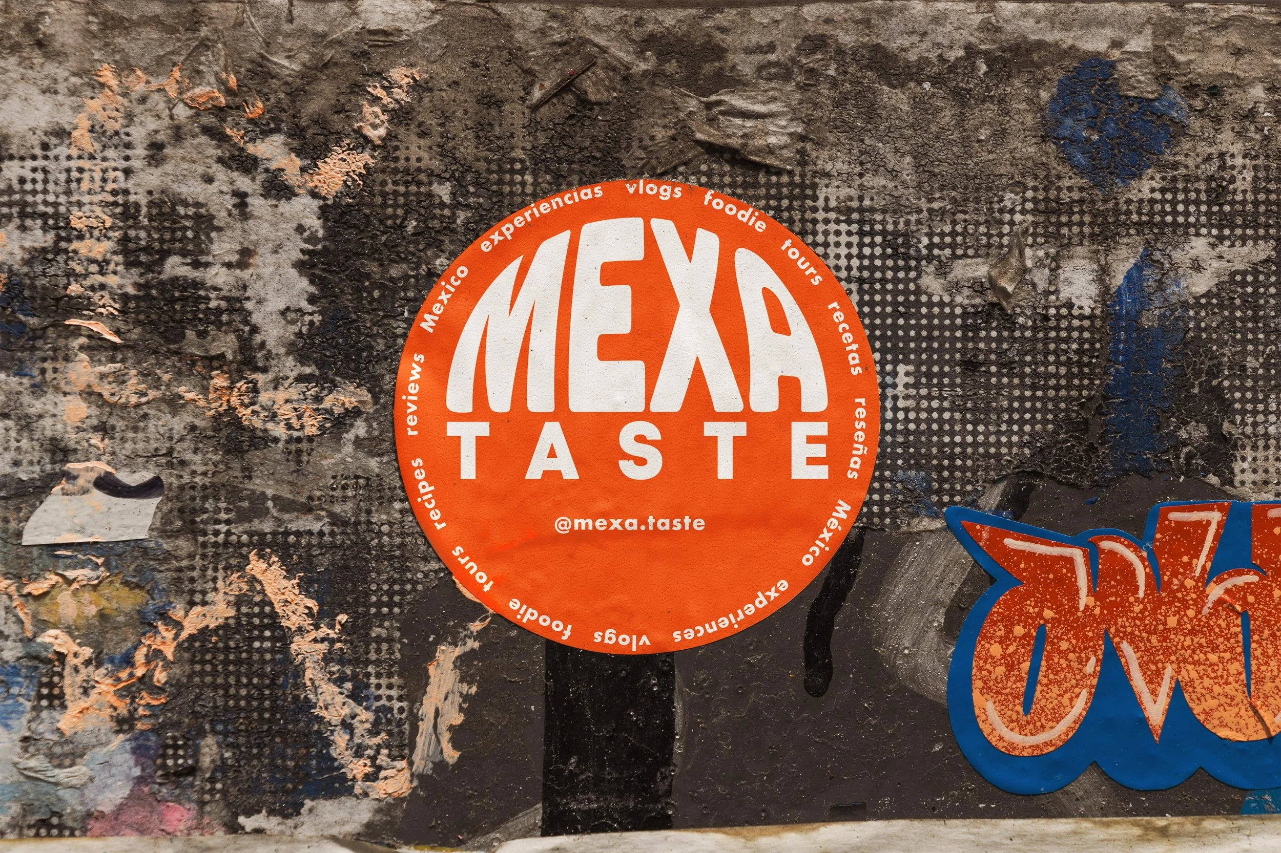
MEXA TASTE
Mexa Taste is the brand identity for a food influencer and content creator who shares experiences around Mexican gastronomy, culture, and street food. The goal was to create a look that feels fresh, vibrant, and street-ready, reflecting both the energy of Mexico and the digital culture of food vlogging.
The logo uses bold, stretched typography that recalls retro signage while staying modern and playful. A strong palette of orange, blue, and white gives the brand instant recognition and carries through packaging, apparel, and digital platforms.
The system works across stickers, merch, and social content, giving Mexa Taste a flexible but distinctive voice. It feels authentic, approachable, and built to live both on the streets and on screens.